El rincón del Nómada. Rural retreats brand.
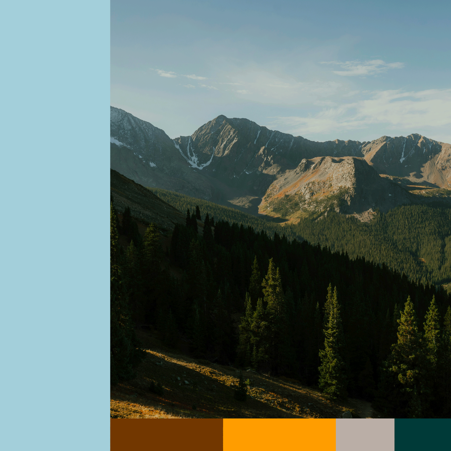
El Rincón del Nómada” is a brand created for rural retreats located in León, on the border with Asturias, in the Babia region of Spain. It is a remarkable enclave surrounded by unspoiled nature. The challenge was to convey the sense of peace, disconnection, and energy of the Babia landscape, with a contemporary and fresh touch, while preserving the essence and elegance of the region’s traditional rural heritage.
El rincón del Nómada es una marca creada para casas rurales situadas en León, frontera con Asturias, en la región de Babia, España. Es un enclave increíble en plena naturaleza viva. El reto era transmitir la paz, desconexión y energía del paraje de Babia, con un matiz actual y freco pero manteniendo la esencia y elegancia de las casas rurales de la región.
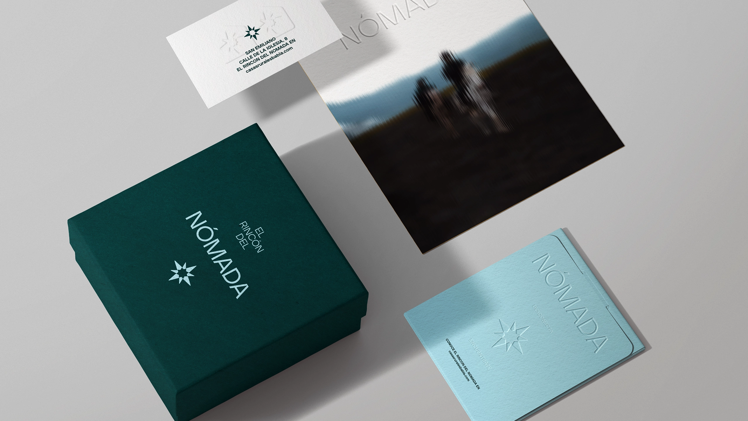
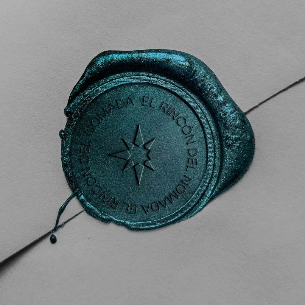
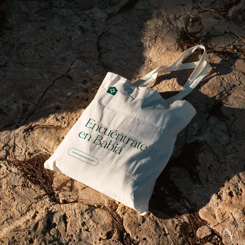
Nomad has been associated with a compass, an ancestral object used for orientation. It represents the connection between getting lost and finding oneself—an energy deeply felt in an idyllic place like the Babia region. Babia is a space for disconnecting from the outside world and reconnecting with yourself, with mental peace and your inner world. The symbol also evokes a star, as the Babia region has been declared a UNESCO Starlight Reserve.
Nómada, se ha asociado con una brújula, objeto ancestral para ubicarse. Conexión entre perderse y encontrarse, propio de la energía que se respira en un lugar idílico como la zona de Babia, como lugar de desconexión del mundo exterior y conexión contigo mismo, con la paz mental y tu mundo interior, además de evocar una estrella, ya que la región de Babia ha sido daclarada reserva Starlight por la UNESCO.
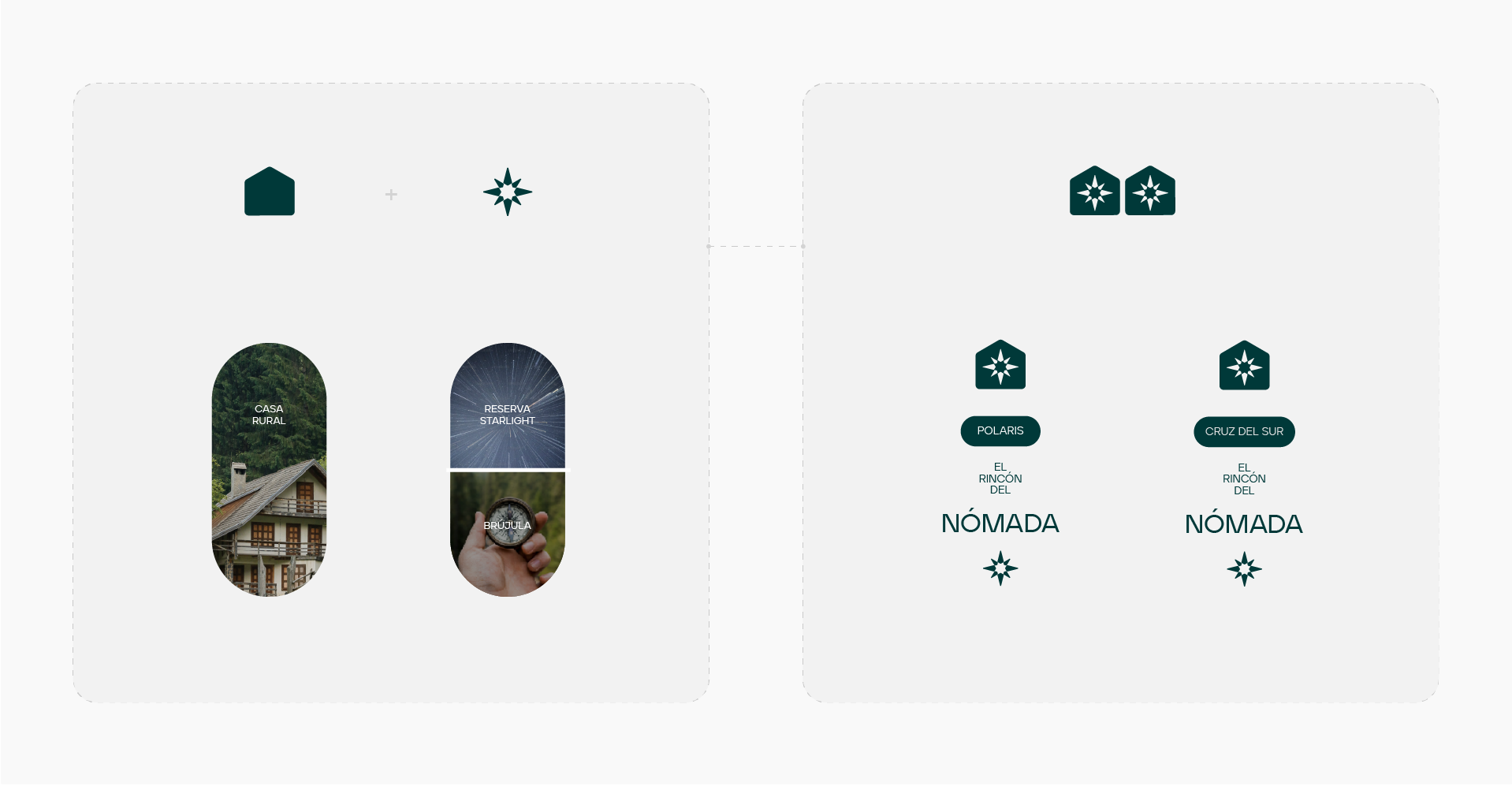
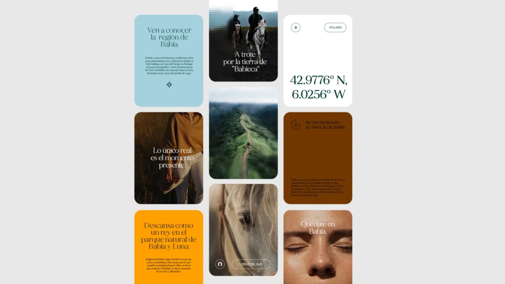
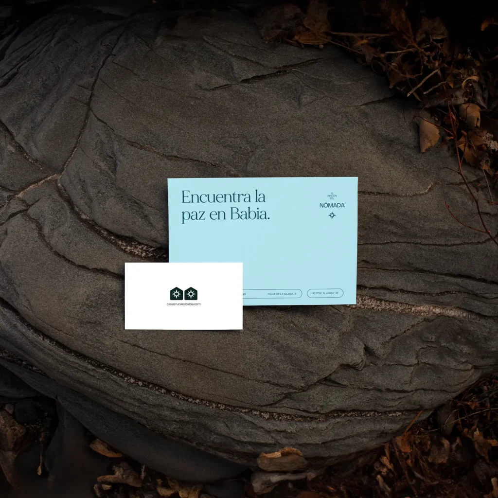
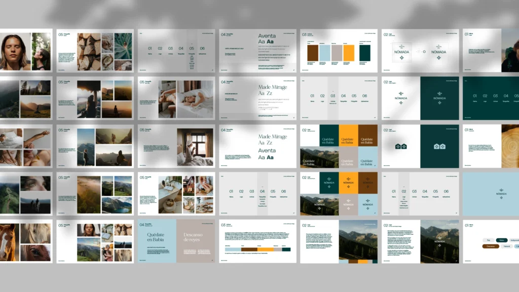
In the previous image, we can see how the logo has been constructed, with each house icon representing a rural accommodation. Polaris is one of the lodgings, and Cruz del Sur is another. Depending on its application, either the full El Rincón del Nómada logo will be used, or only the icon corresponding to each individual house.
En la anterior imagen vemos cómo se ha formado el logotipo, correspondiendo cada icono de casa a un alojamiento rural. Polaris es un alojamiento, y Cruz del sur es otro. Según la aplicación de la que se trate, se usará el logotipo completo del Rincón del Nómada, o sólo el icono correspondiente a cada casa.


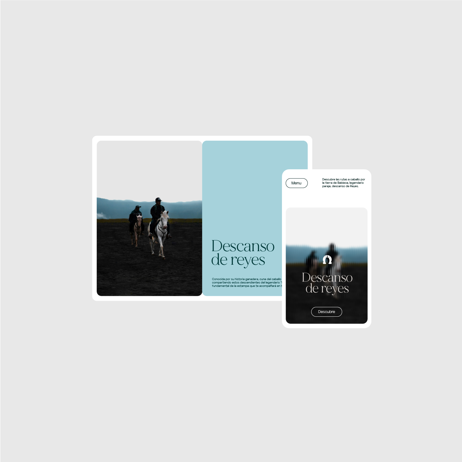
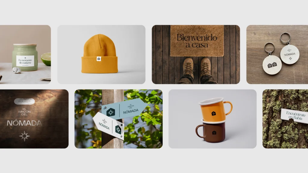
Polaris and Cruz del Sur. Inspired by their ancestral character—like the compass—the names are based on the techniques traditionally used to find one’s way and navigate a journey, but following different coordinates: one to the south and the other to the north.
Polaris y Cruz del Sur. Inspirado en su carácter ancestral, como la brújula, los nombres se basan en las técnicas usadas para encontrarse y guiarse en el camino. Pero siguiendo diferentes coordenadas, una sur y la otra el norte.
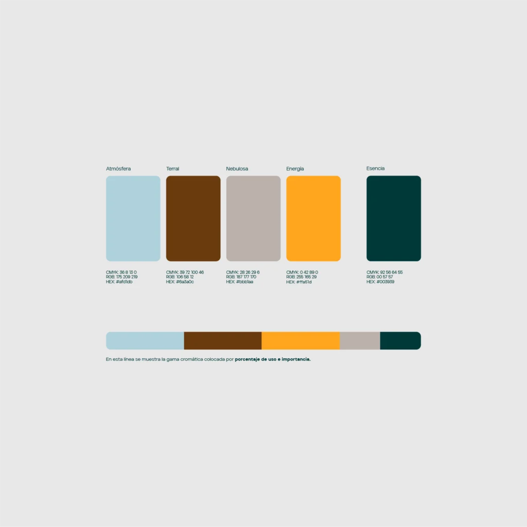
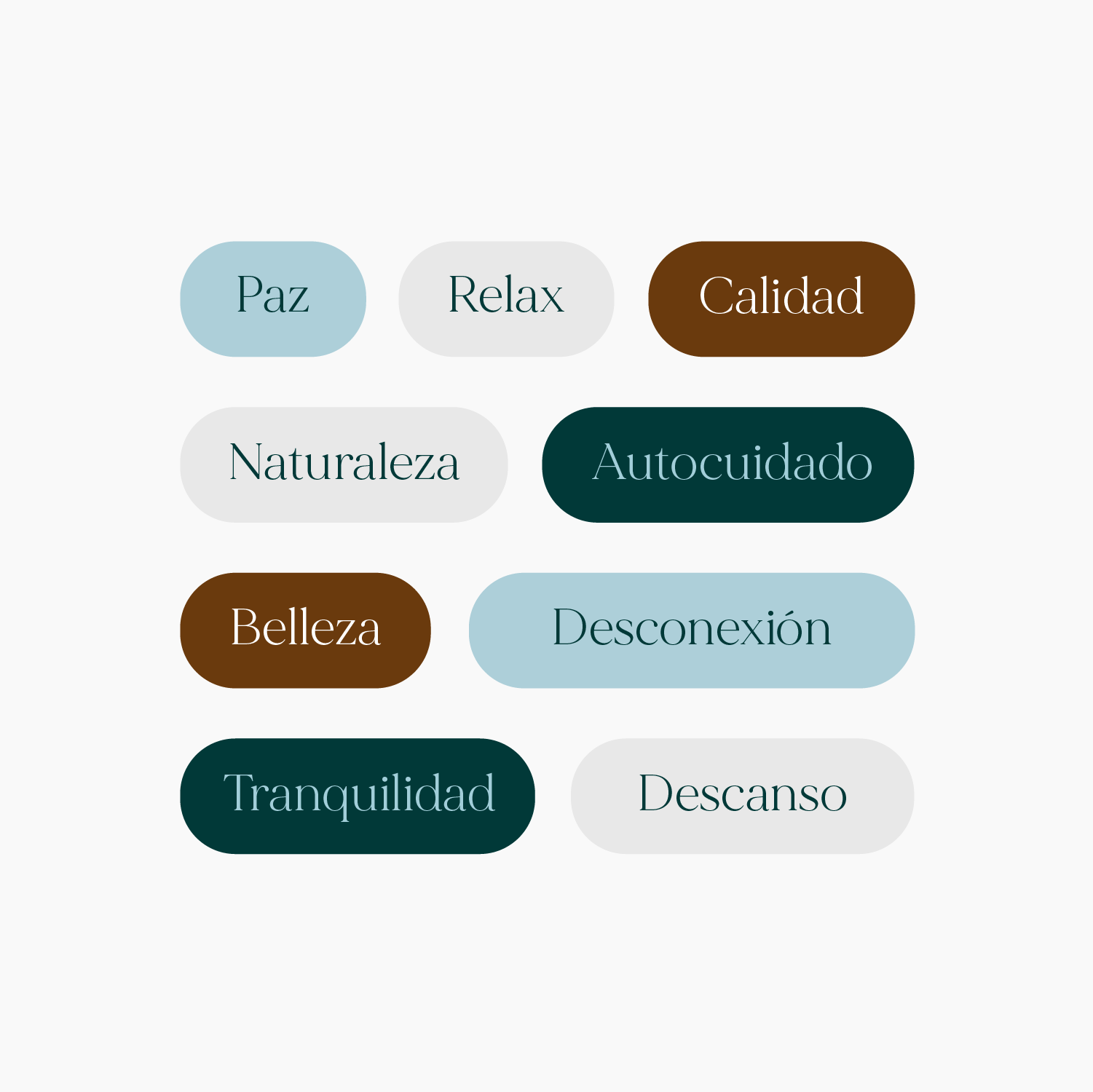
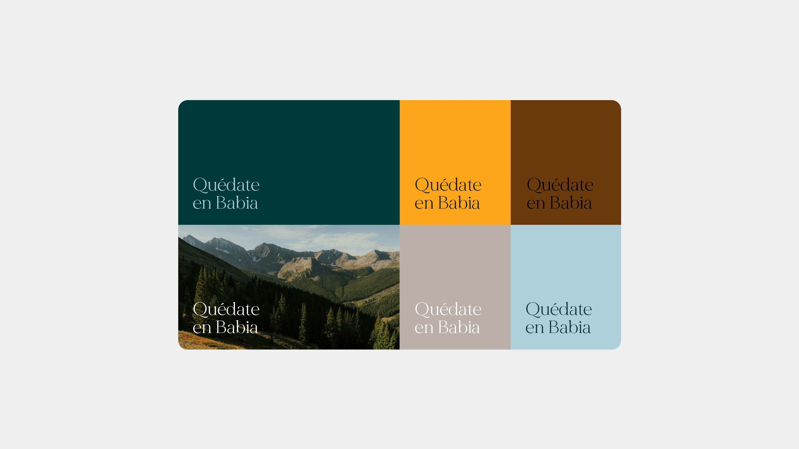
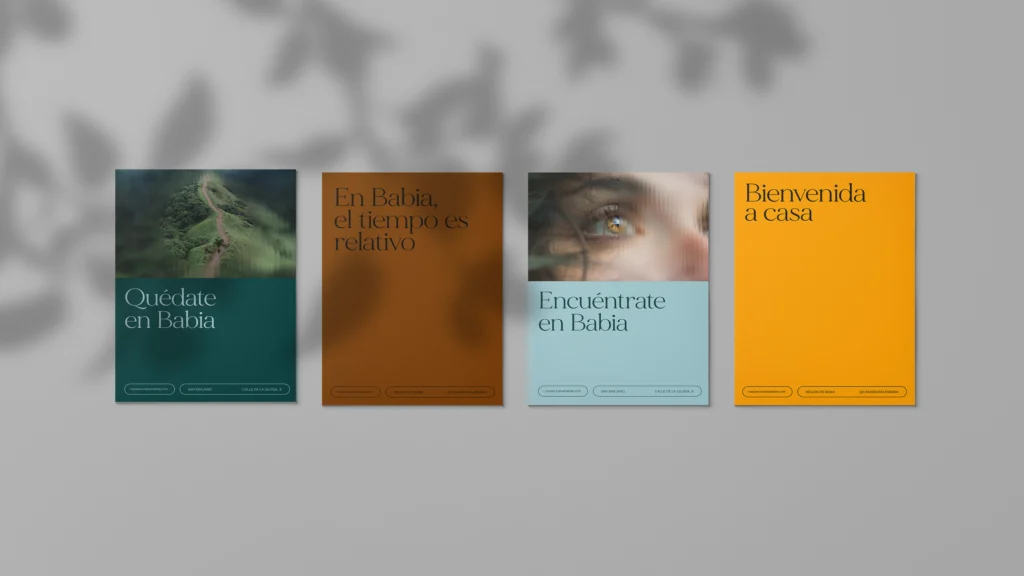
The color palette is created through a balance between vibrant and soft tones, bringing a sense of peace and calm while also adding intensity and personality to the brand identity. Four primary colors have been selected, to be combined in each piece according to its needs. In addition, Esencia is an accent color used to add value to more special brand content.
La gama de colores se crea gracias a un equilibrio entre colores vibrantes y suaves que aportan paz y calma al mismo tiempo que intensidad y personalidad a la identidad. Se han elegido cuatro colores primarios que se combinarán en cada pieza según la necesidad. Y Esencia, un color adicional para aportar valor a un contenido un poco más especial de la marca.
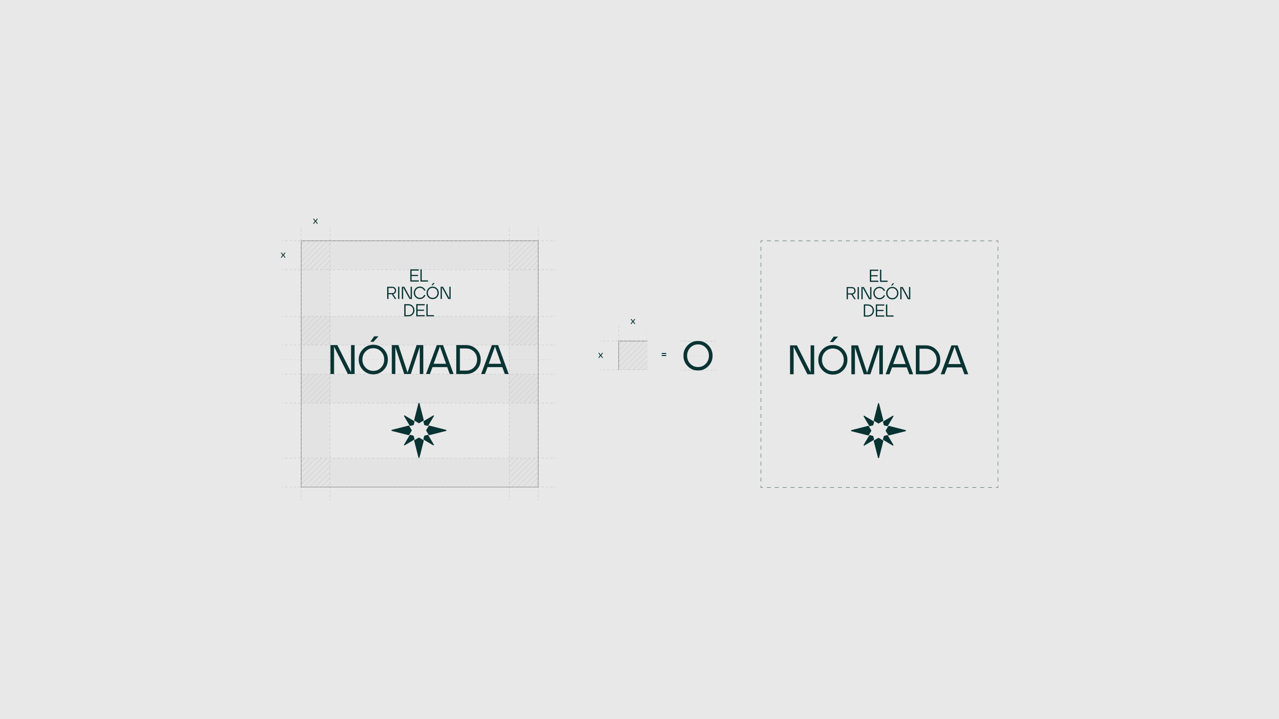
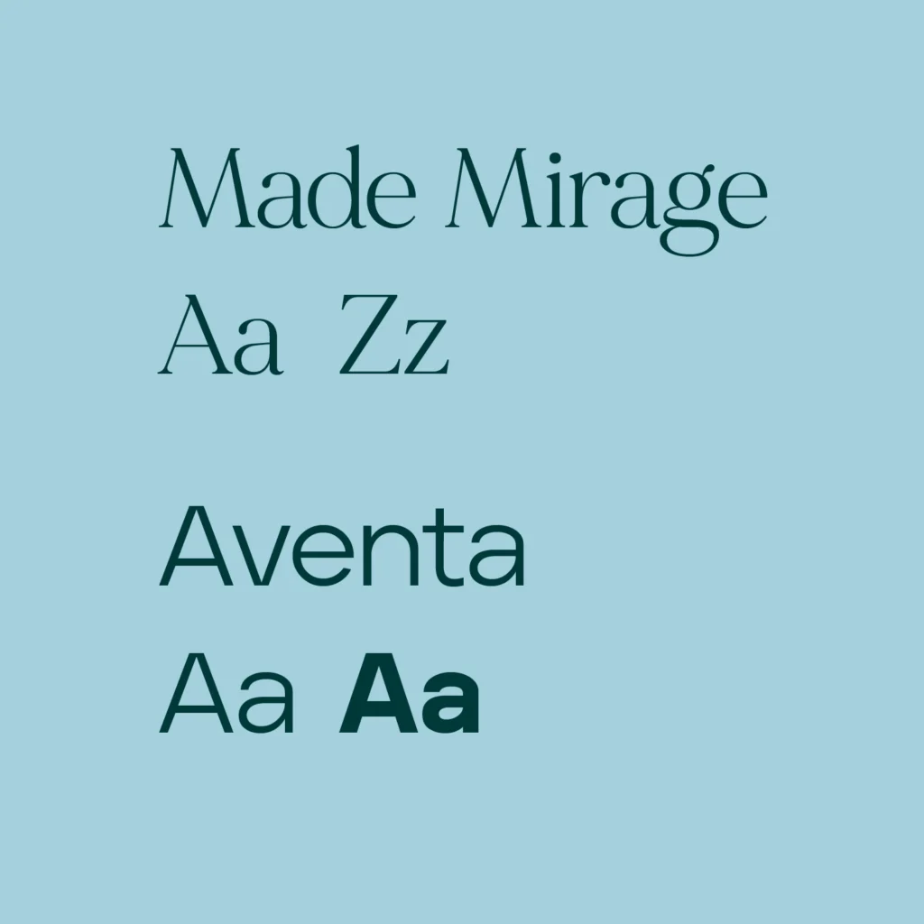
A combination of two contrasting typefaces has been chosen, both with harmonious and friendly forms. Together, they allow for multiple possible compositions, creating calm, approachable messages.
Se ha optado por la combinación de dos tipografías dispares pero ambas de formas armoniosas y amables. Juntas crean múltiples composiciones posibles creando mensajes calmados y cercanos.
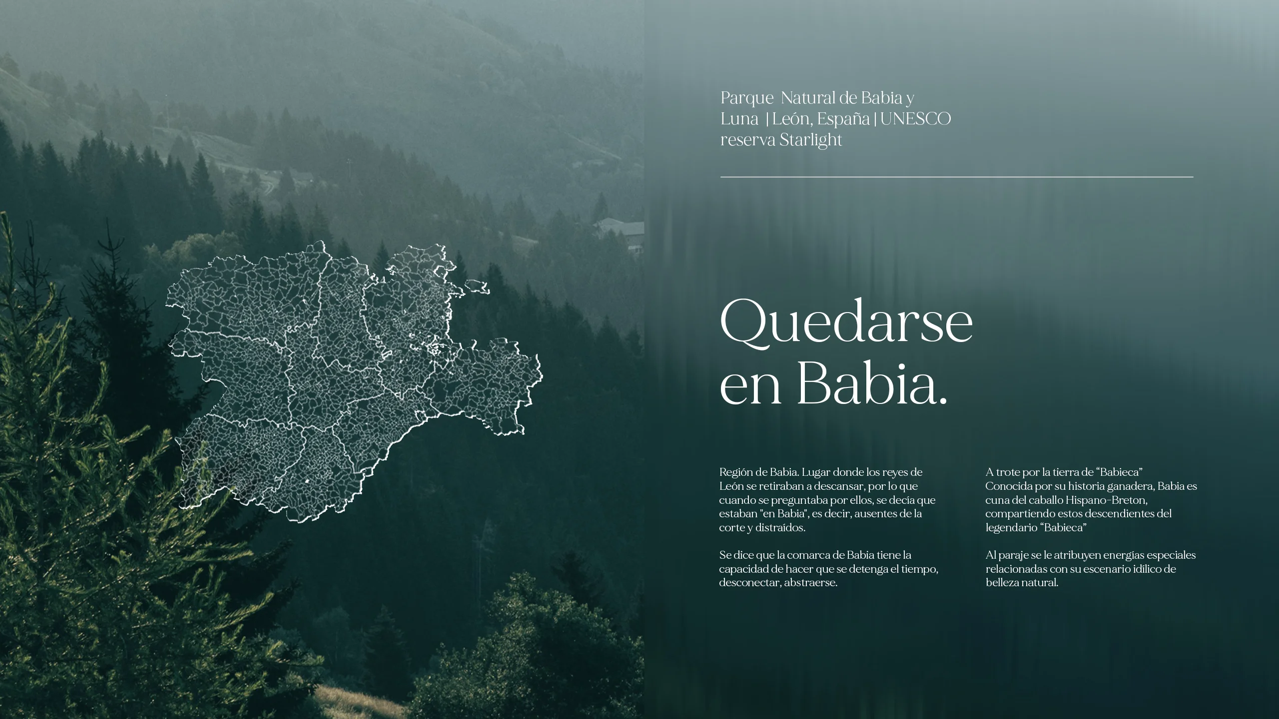
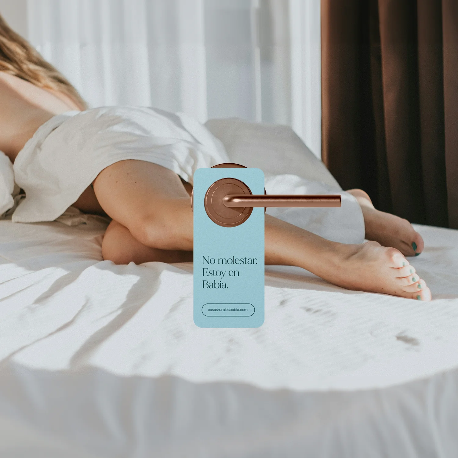
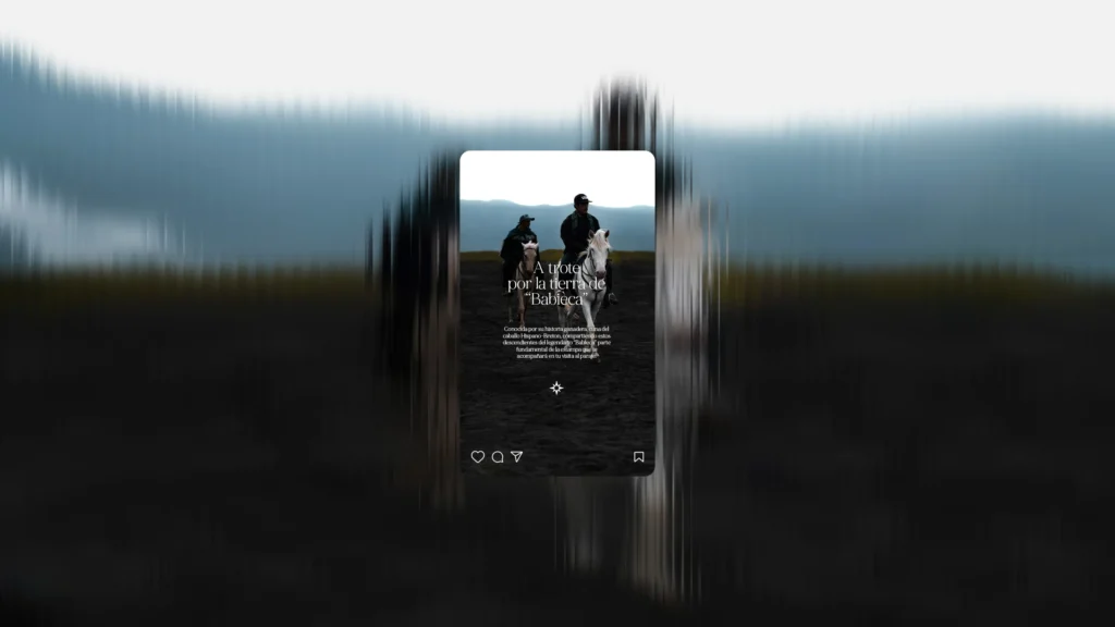
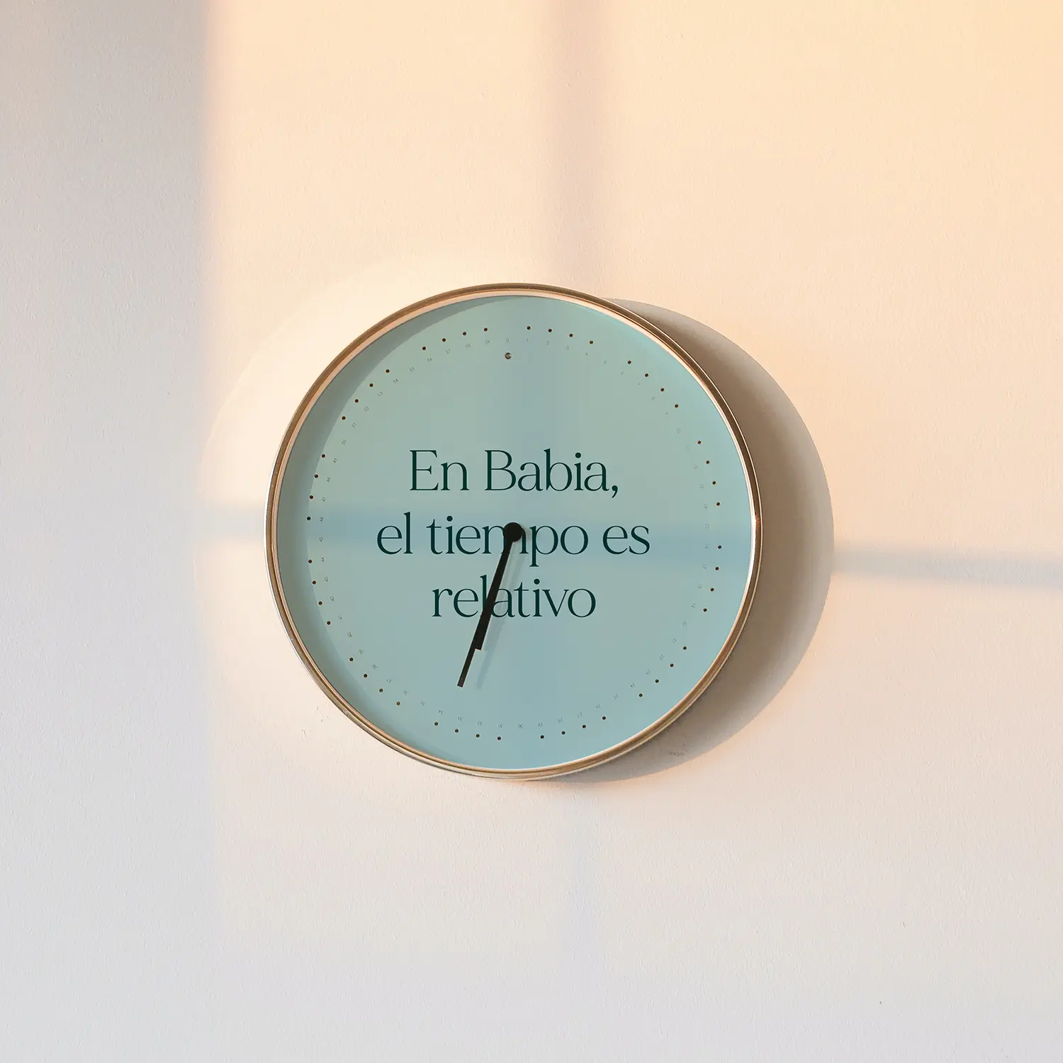
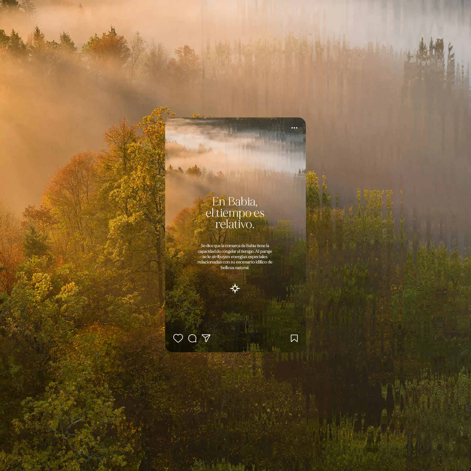
The “Being in Babia” effect.
With this effect, we create a dreamlike scenario that alludes to the well-known Spanish expression “quedarse en Babia,” commonly used to describe a state of being lost in thought or deeply absorbed. We use this expression figuratively—being in Babia, going to Babia—as a way of being elsewhere, in your own world, immersed in your thoughts. A state of mental peace and relaxation. Through this effect, we aim to visually convey this feeling by subtly dissolving reality, creating a soft, dreamlike atmosphere.
Con este efecto creamos un escenario onírico que alude a la famosa frase “quedarse en Babia”, usada comúnmente para referirse cuando alguien se queda ensimismado. Usamos de forma figurativa este famoso dicho Estar en Babia. Pasar a Babia. Estar en otro lado, en tu mundo, absorto en tus pensamientos. En un estado de paz mental, y relax. Queremos transmitir visualmente este sentimiento con este efecto, que diluye la realidad de una manera muy sutil, creando ese ambiente de ensueño.
Created in collaboration with María Dobarro
Every creation begins with action
Ver más proyectos